
Better UI Components with the Storybook (Part 1)
At Ouicar, our frontend code is composed of more than an hundred of React Components (Calendars, DatePickers, Registration Forms, Collapsible Menu, etc…). As our application grows, documenting and testing our UI becomes more and more tedious.
In order to improve the testability of our Components, we decided to build a tool that allows us to isolate and test each component independently. This practice has been democratized by the React Storybook project from Arunoda Susiripala.
This approach gives multiple advantages:
- the developer productivity is increased,
- the code is cleaner,
- a better communication with Designer and QA.
A trivial example
Suppose that we are building a registration form. Here is how it is supposed to behave:
- the page is only accessible to non authentified users,
- the form displays errors when fields are not filled properly,
- after the form has successfully been submitted a success message is shown,
- then after 5 seconds it disappears,
- at the end, the user is automatically logged-in.
This example looks very trivial. But what about developing the feature? In a classic workflow, you as a developer would:
- sign out if already logged-in,
- then click on the “Sign In” button,
- enter erroneous data in the form in order to see error messages
- refresh the page,
- fill the form again with correct data,
- submit again and check if the success message displays and hides automatically,
- logout and try again…
Imagine that you have to do that each time you need to work on a feature? I cannot even imagine…

Storybook to the rescue
The “StoryBook” is a tool that allows us to design and develop components outside the real application in an isolated environment. Here is our storybook in action:
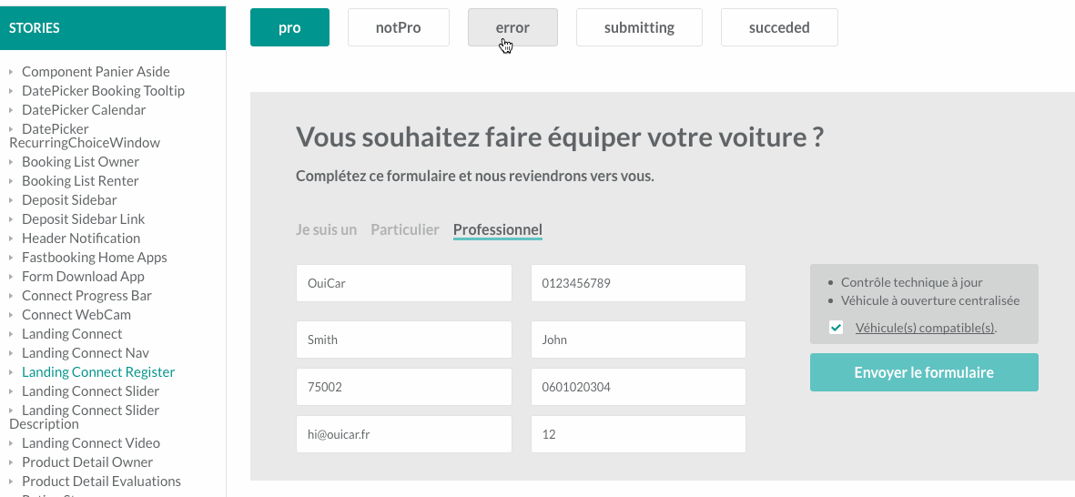
As you can see, it’s easier to reason about our component. We can freeze the UI to any state by just clicking on the corresponding button. We can simulate errors, success or even states that are very difficult to test in a real life application like disabling inputs while an HTTP request is running.
The process of developing and testing our form has been dramatically improved. The form is isolated from the rest of the application and easily testable.
Cleaner code with “Storybook Driven Development”
We have seen that using the “Storybook” provides a much faster workflow. The productivity of frontend developers can be greatly improved with such a wonderful tool. Ok it is fast. But what about the quality of the code?
At Ouicar we realized that the more we strive for creating our component within the “Storybook”, the more reusable and clean our code is.
In fact, writing UI components by passing data via props forces us to favor dumb components over smart ones what many consider as a best practice when working with React. By doing so, it’s much easier to reason about our code and testing is facilitated.
This is how we define a “Story” for our component:
import React from 'react';

// We import our component.
import RegistrationForm from 'ouicar/desktop/landing-connect/register.jsx';

// This Mock Object allows us to inject fake content to our dumb component.
import * as Mock from 'ouicar/integration/story/landing-connect/mock';

// Utils see https://lodash.com/docs#mapValues
import _mapValues from 'lodash/object/mapValues';

export default _mapValues({
	['default']:
		<RegistrationForm
			fields={Mock.fields}
			requestSucceded={false}
			submitting={false}
		/>,
	error:
		<RegistrationForm
			fields={_mapValues(Mock.fields, field => MockForm.addError(field, 'Erreur inattendue'))}
			requestSucceded={false}
			submitting={false}
		/>,
	submitting:
		<RegistrationForm
			fields={Mock.fields}
			requestSucceded={false}
			submitting
		/>,
	succeded:
		<RegistrationForm
			fields={Mock.fields}
			requestSucceded
			submitting={false}
		/>
}, component =>
	<div className="registration-form-wrapper">
		{component}
	</div>
);
Here is our Pure Component:
import React, {Component} from 'react';
export default class RegistrationForm extends Component{
handleFormSubmit = () => {
...
};
renderFields() {
.....
}
renderSuccessMessage() {
.....
}
renderForm(): {
return (
<form key="form" className="mt4" onSubmit={this.handleFormSubmit}>
<div className="pg-landingconnect-form display-flex align-top mt3">
{this.renderFields()}
<div className="form-elements">
<button className="defaultlight wd-100 mt1" disabled={this.props.submitting}>
{this.props.submitting ? 'Patientez ...' : 'Envoyer le formulaire'}
</button>
</div>
</div>
</form>
);
];
}
render(): Element {
return (
<div className="bg-dark mt4" id="landing-connect-register-form">
<div className="inside-flex pa3">
<h2 className="fz-30 fwb">Vous souhaitez faire équiper votre voiture ?</h2>
{this.props.requestSucceded ?
this.renderSuccessMessage():
this.renderForm()
}
</div>
</div>
);
}
}Before running our component in the real life project, we build it from scratch in the “Storybook”. This means:
- defining an exhaustive list of the states (not to confound with the State in React) of our component (
default,error,submitting, etc…), - listing all the properties needed for our component,
- writing code and Test in the Storybook,
- at the end running your component in your project.
At Ouicar we call this approach “SDD”. That’s the shortname for “Storybook Driven Development”. There’s a very obvious parallel that we can draw with Test Driven Development when building our components directly in the “Storybook”:
- we can create the Story before writing the Program,
- we code and test the component iteratively,
- when adding a new feature in the component, we can easily check if everything works as expected.
A Live documentation
The last great advantage of the storybook is that it provides a rich documentation for your components. At Ouicar, It has greatly improved communication between Front-End Developers and non-Tech people (Product Owners, Designers, etc…). For example, if the Designer needs to change the look and feel of a “Throbber” or a “Button”, he opens the Storybook, and make the modification directly from there. When done, he can show the modifications to the Developer or any other member of the team who can be interested in the update. The Storybook becomes the single source of truth for UI documentation and so avoids confusion and promotes reusability.
Closing thoughts
Through this article, we have seen how efficient the “Storybook” approach is. In addition to make component development faster, it forces us to have well written components and offers a great documentation. This approach has meaningfully changed the way we build User Interfaces here at Ouicar and it’s a must use. I suggest that you take a look at React Storybook and start writing happy stories!
In the 2nd Part of this article, we will go more in depth and we will build our registration form story using the React StoryBook Project.. So stay tuned!
Comments