
Better UI components with the Storybook (Part 2)
Previously we have seen how “Storybook Driven Development” helped us to build better user interfaces at Ouicar. In this part we will install React Storybook and see how it can help us to build a simple registration form.
Below is a simple Gif that shows what we are about to build:
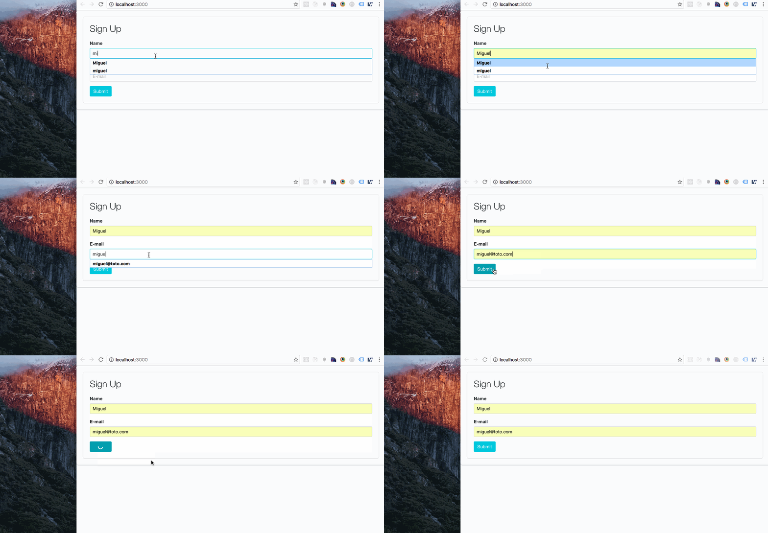
For the sake of simplicity we won’t be doing real API calls, and other complex validation rules. We will focus on concepts around React component development and the React Storybook way of building user interfaces.
Getting Started
First we are going to setup our project. For that, we use the create-react-app command. This provides us an easy and fast running development environment.
Install the package:
npm install -g create-react-app
and create the project:
create-react-app app
cd app
After that, we should be ready to go by running:
npm start
Visit http://localhost:3000 and enjoy :-) That is just how simple it is.
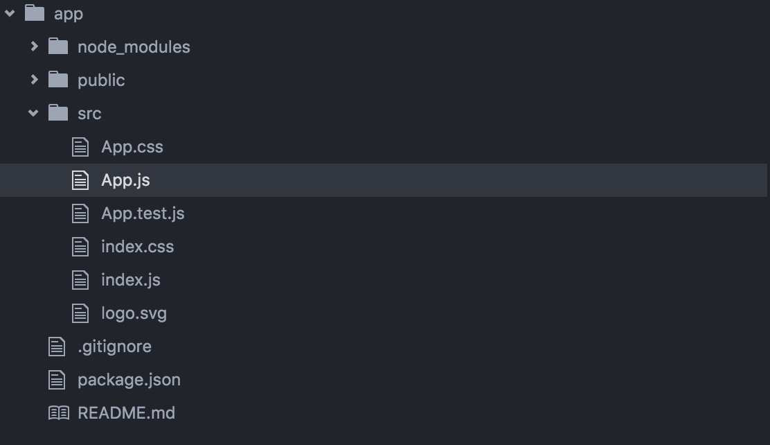
Your working directory should now look like that:
Now that we have our React project ready, we can install React Storybook.
Install the package:
npm i -g getstorybook
Navigate to your project folder:
cd app
Install dependecies in your project:
getstorybook
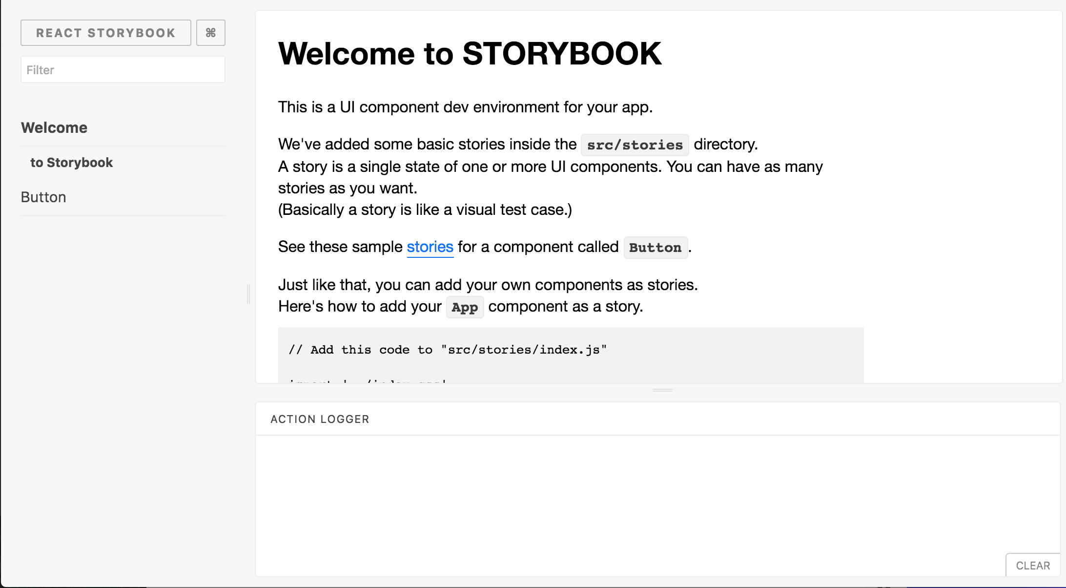
Visit http://localhost:9009/ and you should see this:
Anatomy of our Registration Form
For purposes of simplicity, we won’t be using any flux pattern (like Redux or others) but plain old React. Let’s have a look at what our component is made of.
-
App: This is the entry point of our application. It’s the default higher level component that comes with
create-react-app. It will be used to host our registration form components. -
RegistrationFormContainer: This is the container component of our registration form. It’s a known best practice to create this kind of component that is responsible of saving state and manage side effects (see Dan Abramov’s explanation). At OuiCar, we suffix them with the “Container” word. You can give another name if you want, but we found it to be very clear and easy to grasp.
-
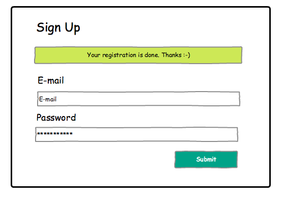
RegistrationForm: This is our dumb component. It’s purpose is purely presentational. It has to be pure (no side effects involved). It’s very important to keep this function pure because it will facilitate it’s integration in React Storybook.
It contains the following HTML elements: a form, a username textField, a password textField, a submit button and a message toast.
Writing our presentational component
Our component can be seen as a simple function that returns HTML Elements.
Then we import it in our app container:
Now let’s add some styles to make it beautifull with Bulma CSS framework.
To keep things simple, we are just going to add the following lines to public/index/html:
<link rel="stylesheet" href="https://cdnjs.cloudflare.com/ajax/libs/bulma/0.1.2/css/bulma.css">
<link rel="stylesheet" href="https://maxcdn.bootstrapcdn.com/font-awesome/4.5.0/css/font-awesome.min.css">
Just after:
<link rel="shortcut icon" href="%PUBLIC_URL%/favicon.ico">
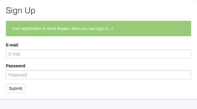
Now you should see your styled React component:
Write stories
This is the real meat and potatoes of “Storybook Driven Development”. Writing stories within React StoryBook is about making functions that describe a specific state of our UI.
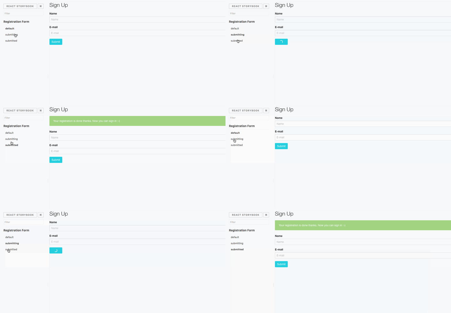
default: This is how our component is displayed by defaultsubmitting: This status is shown when the HTTP request is performed after submitting the formsubmitted: The API call is finished and the server has replied successfully
We didn’t cover all possible states, but in a real life application, you may have additional error status to manage ( server timeout, client side form validation etc…).
Then we load our stories in the storybook:
For now, our storybook is not very interesting as we are displaying the same component without any visual change.
Put some props
Let’s inject some props to our registration form.
submitted: When truthy, we display the confirmation message,onSubmit: this callback is called whenever we submit the form,submitting: When truthy, we display a spinner on the submit button thanks to theis-loadingclass name.
The main strength of React Storybook is the way it allow us to quickly visualise state variations. So let’s update our storybook with different props values according to each state.
Hooray! Our component is now fully “storybooked”.
Build the final component
We can now build the parent container component that will manipulate our form.
This component contains a state that contains the same properties as the RegistrationForm props except the onSubmit callback.
handleSubmit: Called when the Form is submitted. It updates the state by passing the “submitting” property to “true” and triggers an HTTP Request.submitHttpRequest: This is a fake implementation of an asynchronous API Call. Once the request is finished, we put back the “submitting” property to “false”hideMessage: Hides the success message after 2 seconds and puts back the “submitted” and “submitting” properties to false.
Finally, we import the container component in the root App, and we are done!
Conclusion
In the first part we saw how the Storybook approach at Ouicar helped us to
increase our productivity, have a cleaner codebase and improve communication between members of the team.
In this second and final part, we managed to build a simple registration form using “Storybook Driven Development”. First we started by building a stateless representation of our component. Then we declined all the possible “states” of our component in React Storybook. And finally, we built our statefull component on top of that.
I Hope that this serie of articles will help you to embrace the SDD Approach. It’s really something to consider when doing front-end development as it can greatly improve the way you build user interfaces.

Comments